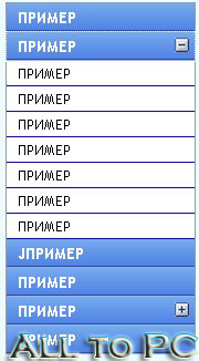
Вертикальное выпадающее меню. Очень красивое.
Установка:
1. Скачать этот АРХИВ
2. загрузить картинки и js файлы в корень сайта.
3. Заменить все надписи типа "Сылка", "Пример" на свои.
4. Вставить этот скрипт в место где выхотите что б было меню.
Code
<script type="text/javascript" src="jquery-1.2.6.pack.js"></script>
<script type="text/javascript" src="ddaccordion.js">
</script>
<script type="text/javascript">
ddaccordion.init({
headerclass: "submenuheader", //Shared CSS class name of headers group
contentclass: "submenu", //Shared CSS class name of contents group
revealtype: "click", //Reveal content when user clicks or onmouseover the header? Valid value: "click" or "mouseover
mouseoverdelay: 200, //if revealtype="mouseover", set delay in milliseconds before header expands onMouseover
collapseprev: true, //Collapse previous content (so only one open at any time)? true/false
defaultexpanded: [], //index of content(s) open by default [index1, index2, etc] [] denotes no content
onemustopen: false, //Specify whether at least one header should be open always (so never all headers closed)
animatedefault: false, //Should contents open by default be animated into view?
persiststate: true, //persist state of opened contents within browser session?
toggleclass: ["", ""], //Two CSS classes to be applied to the header when it's collapsed and expanded, respectively ["class1", "class2"]
togglehtml: ["suffix", "<img src='plus.gif' class='statusicon' />", "<img src='minus.gif' class='statusicon' />"], //Additional HTML added to the header when it's collapsed and expanded, respectively ["position", "html1", "html2"] (see docs)
animatespeed: "fast", //speed of animation: integer in milliseconds (ie: 200), or keywords "fast", "normal", or "slow"
oninit:function(headers, expandedindices){ //custom code to run when headers have initalized
//do nothing
},
onopenclose:function(header, index, state, isuseractivated){ //custom code to run whenever a header is opened or closed
//do nothing
}
})
</script>
<style type="text/css">
.glossymenu{
margin: 5px 0;
padding: 0;
width: 170px; /*width of menu*/
border: 1px solid #9A9A9A;
border-bottom-width: 0;
}
.glossymenu a.menuitem{
background: black url(glossyback.gif) repeat-x bottom left;
font: bold 14px "Lucida Grande", "Trebuchet MS", Verdana, Helvetica, sans-serif;
color: white;
display: block;
position: relative; /*To help in the anchoring of the ".statusicon" icon image*/
width: auto;
padding: 4px 0;
padding-left: 10px;
text-decoration: none;
}
.glossymenu a.menuitem:visited, .glossymenu .menuitem:active{
color: white;
}
.glossymenu a.menuitem .statusicon{ /*CSS for icon image that gets dynamically added to headers*/
position: absolute;
top: 5px;
right: 5px;
border: none;
}
.glossymenu a.menuitem:hover{
background-image: url(glossyback2.gif);
}
.glossymenu div.submenu{ /*DIV that contains each sub menu*/
background: white;
}
.glossymenu div.submenu ul{ /*UL of each sub menu*/
list-style-type: none;
margin: 0;
padding: 0;
}
.glossymenu div.submenu ul li{
border-bottom: 1px solid blue;
}
.glossymenu div.submenu ul li a{
display: block;
font: normal 13px "Lucida Grande", "Trebuchet MS", Verdana, Helvetica, sans-serif;
color: black;
text-decoration: none;
padding: 2px 0;
padding-left: 10px;
}
.glossymenu div.submenu ul li a:hover{
background: #DFDCCB;
colorz: white;
}
</style>
<div class="glossymenu">
<a class="menuitem" href="ССЫЛКА">ПРИМЕР</a>
<a class="menuitem submenuheader" href="ССЫЛКА" >ПРИМЕР</a>
<div class="submenu">
<ul>
<li><a href="ССЫЛКА">ПРИМЕР</a></li>
<li><a href="ССЫЛКА">ПРИМЕР</a></li>
<li><a href="ССЫЛКА">ПРИМЕР</a></li>
<li><a href="ССЫЛКА">ПРИМЕР</a></li>
<li><a href="ССЫЛКА">ПРИМЕР</a></li>
<li><a href="ССЫЛКА">ПРИМЕР</a></li>
<li><a href="ССЫЛКА">ПРИМЕР</a></li>
</ul>
</div>
<a class="menuitem" href="ССЫЛКА">JПРИМЕР</a>
<a class="menuitem" href="ССЫЛКА">ПРИМЕР</a>
<a class="menuitem submenuheader" href="ССЫЛКА">ПРИМЕР</a>
<div class="submenu">
<ul>
<li><a href="ССЫЛКА">ПРИМЕР</a></li>
<li><a href="ССЫЛКА">ПРИМЕР</a></li>
<li><a href="ССЫЛКА">ПРИМЕР</a></li>
<li><a href="ССЫЛКА">ПРИМЕР</a></li>
<li><a href="ССЫЛКА">ПРИМЕР</a></li>
<li><a href="ССЫЛКА">ПРИМЕР</a></li>
</ul>
</div>
<a class="menuitem" href="ССЫЛКА" style="border-bottom-width: 0">ПРИМЕР</a>